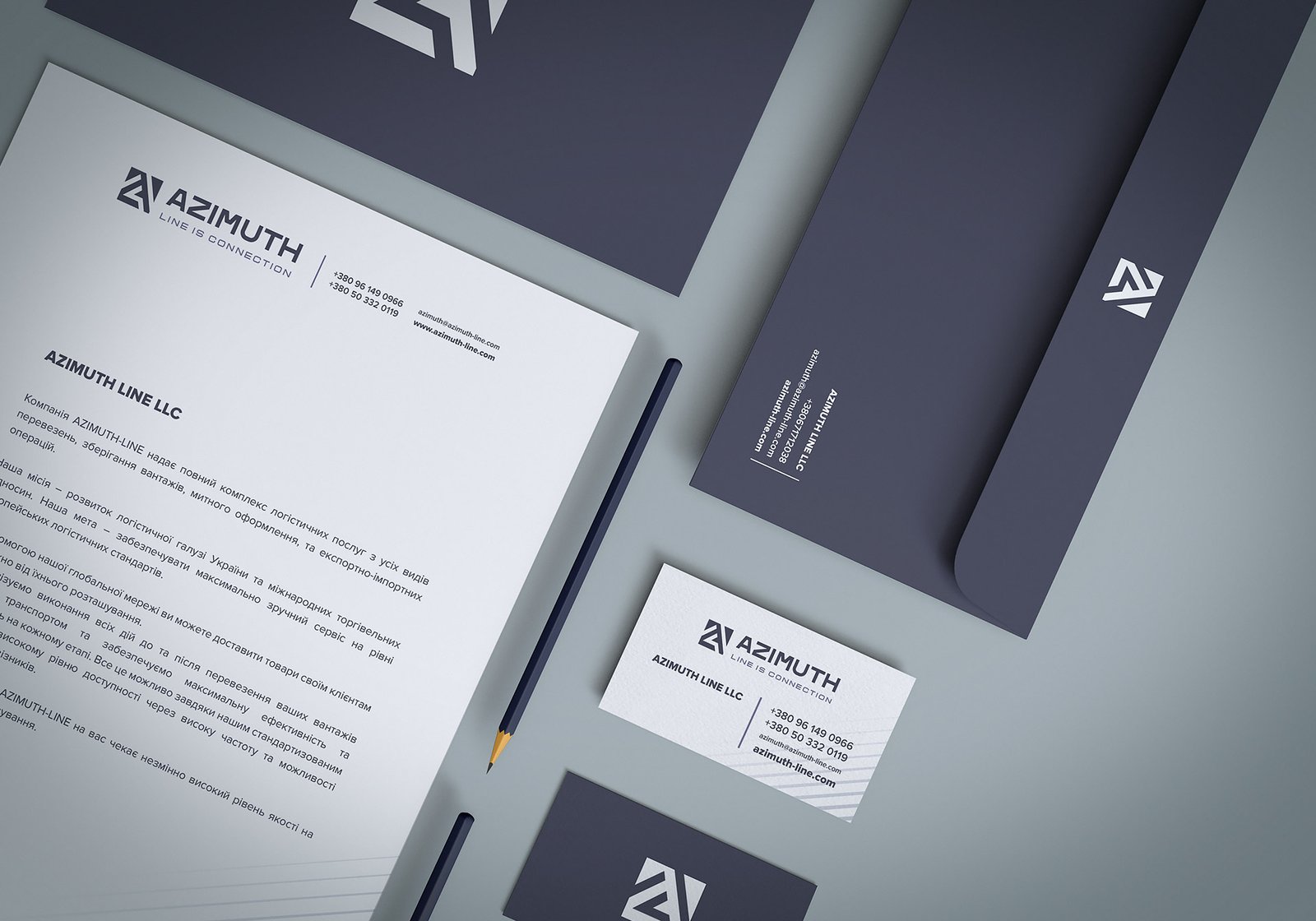
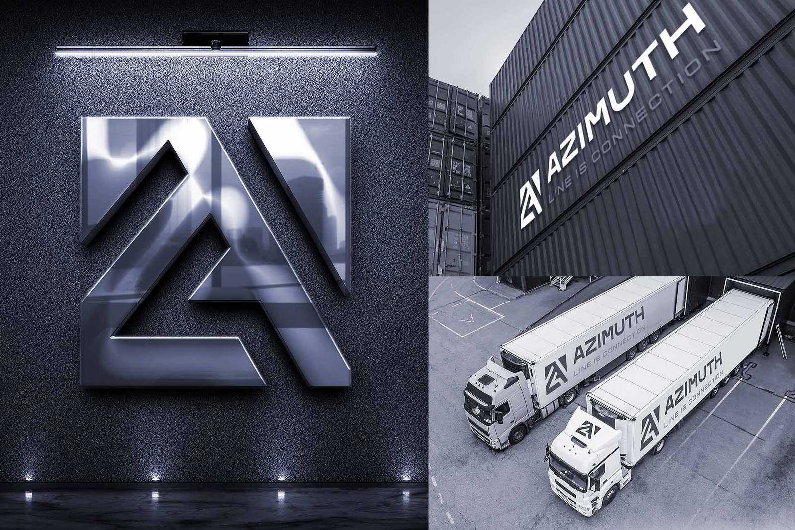
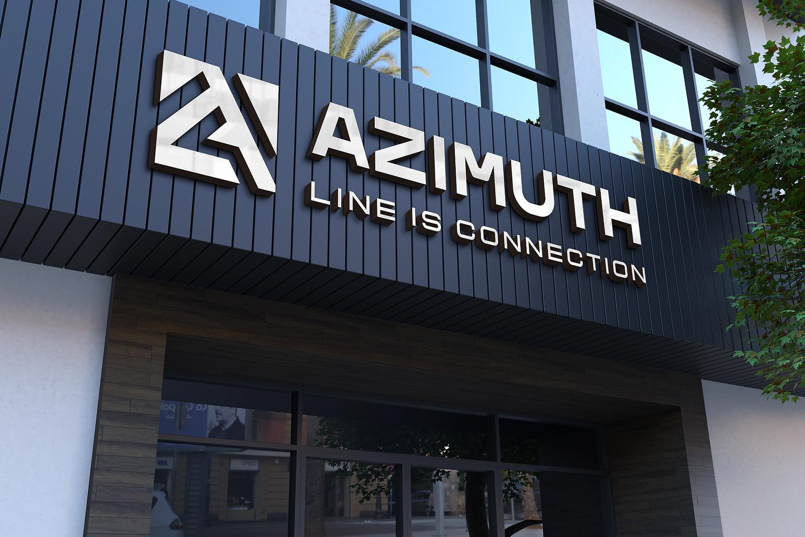
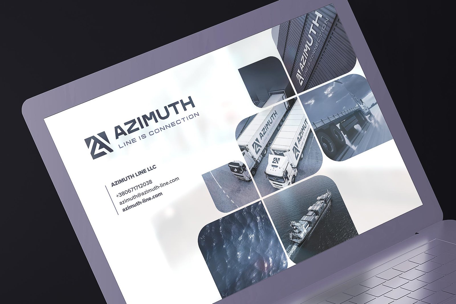
The transport company Azimut Line specializes in forwarding in the field of sea containers and a full range of door-to-door services. Representatives of Azimut Line approached us with the task of creating a unique company logo, as well as a corporate identity and corporate identity guide (brandbook).
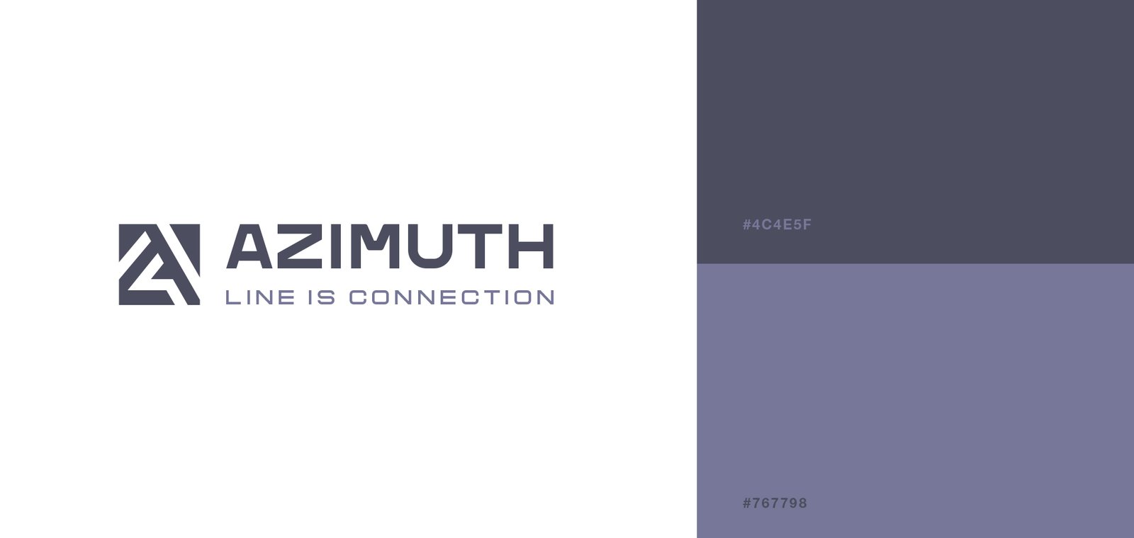
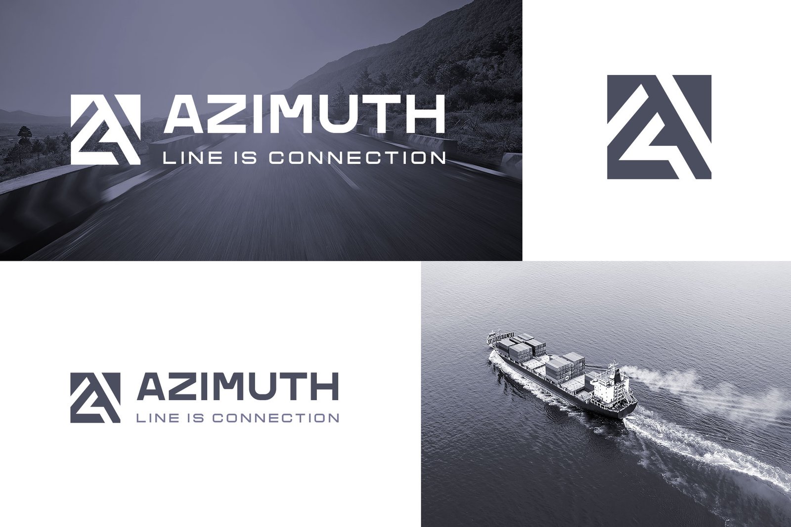
The client’s wishes were as follows: the logo should be in English, for more convenient work with foreign clients, the style of the logo should be simple, strict, concise, the colors of the corporate style – gray, graphite and anthracite.
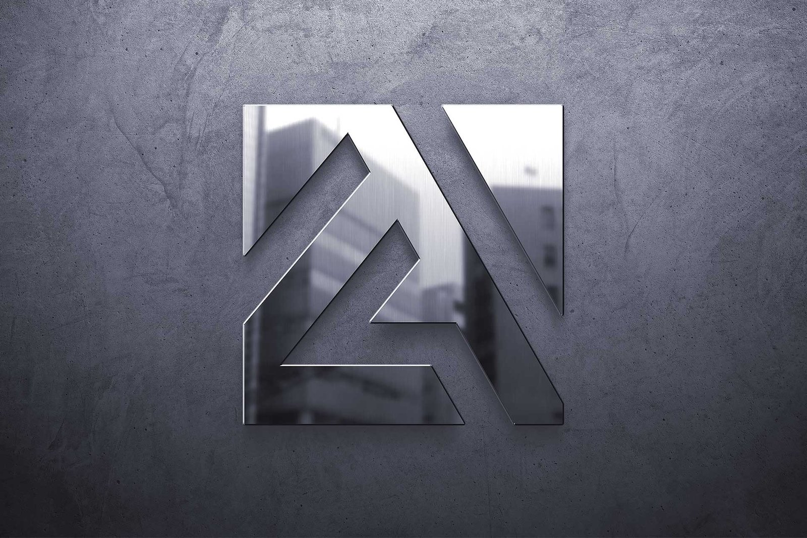
Our designers offered for consideration several sketches of the logo made according to the wishes of the client. As a result, a modern, strict, but at the same time very attractive and memorable option was chosen. The combination of a graphic element in the form of a square, in which we harmoniously placed the capital letter of the name A – Azimuth Line, and a strict font of the name, which is easy to read, create an impression of status, confidence and stability of the company. Such a logo will be associated among customers with trust in the company, its success and will certainly evoke the right emotions in the target audience.
Also, our experts have prepared a complete summary of the rules and necessary standards of visual communication of the brand, designed to help the formation of a unified verbal perception of the brand/company.
The Brand Book for the Azimut Line company contains standard sections devoted to the rules for using corporate style (brand colors, fonts, logos, etc.)
